Bloom & Roll
An elegant, friendly identity for a cinnamon roll café.
- Year
- 2025
- Category
- Branding
- Discipline
- Brand identity
Overview
A visual identity for Bloom & Roll, a café specialising in cinnamon rolls and brioches, designed for women and groups of friends looking for a cosy place to share a treat.
Challenge
Build a universe that feels gourmet and refined without losing the warmth and conviviality of a neighbourhood café.
Direction
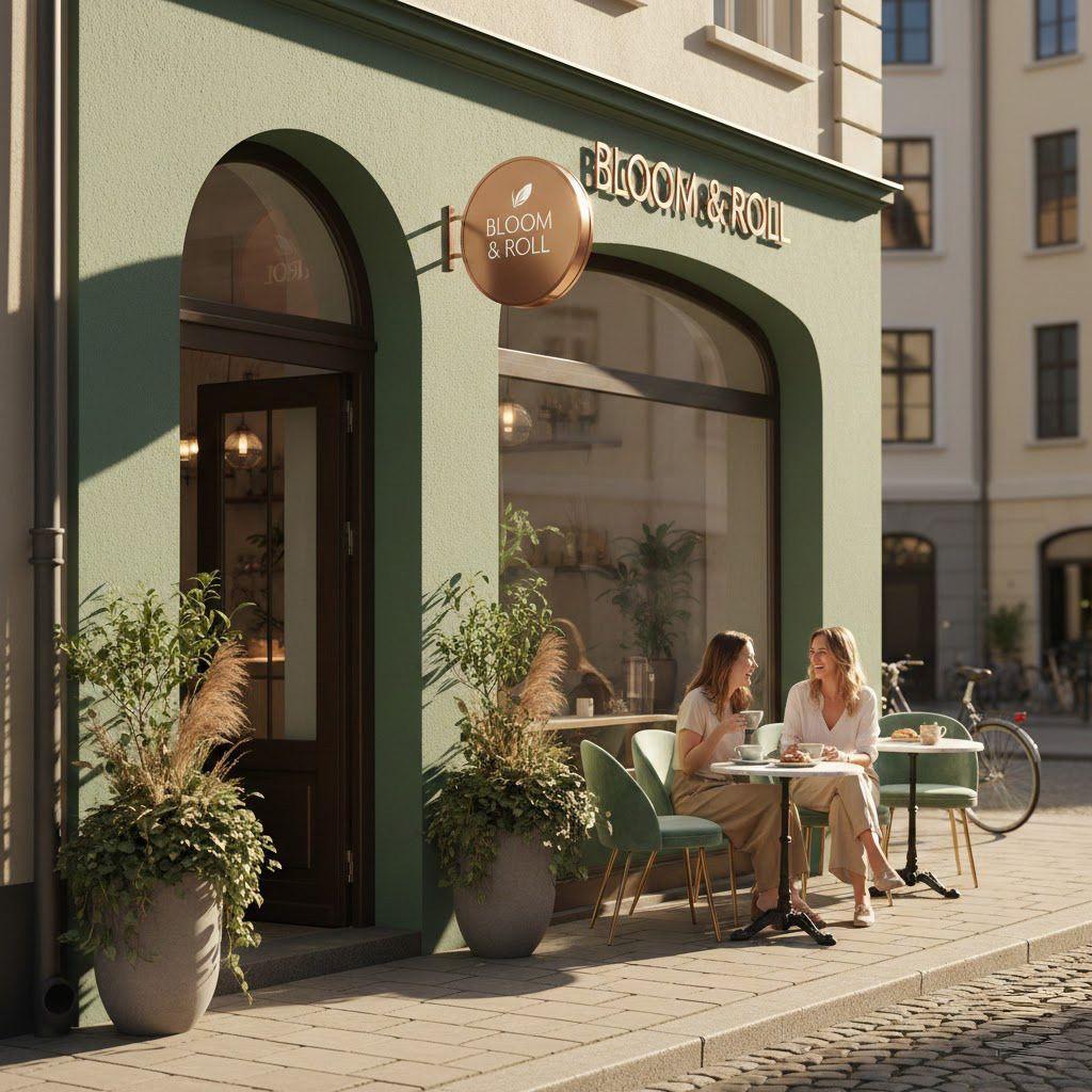
An elegant, convivial and gourmet universe built around two colours — sage green for nature and calm, rose gold for luxury and femininity — applied from the logo to the storefront, packaging and printed matter.
Process
- 01
Research
I started by exploring the target audience and the experience Bloom & Roll wanted to offer. The focus was on women and groups of friends looking for a welcoming place to relax, catch up and enjoy something sweet.
I also explored café branding references, artisanal bakery aesthetics and colour associations to find the right balance between elegance, femininity and comfort.
- 02
Concept
I chose to build the identity around two complementary colours: sage green and rose gold.
Sage green brings a natural, calming and fresh feeling, while rose gold adds a touch of elegance, femininity and indulgence.
Together, they create a distinctive visual universe that feels both sophisticated and approachable, reflecting the brand's personality.
- 03
Design
The visual identity was developed around a soft, elegant and cohesive design language.
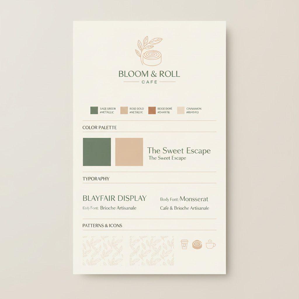
Colour palette: Sage green and rose gold form the foundation of the identity.
Typography: A combination of elegant typography and complementary supporting typefaces creates a balance between sophistication and friendliness.
Graphic elements: Organic shapes and delicate details reinforce the artisanal and feminine character of the brand.
Visual direction: Warm, appetising imagery highlights the textures of cinnamon rolls and brioches, making the brand feel inviting and sensory.
- 04
Delivery
The identity was designed to create a consistent brand experience across every customer touchpoint.
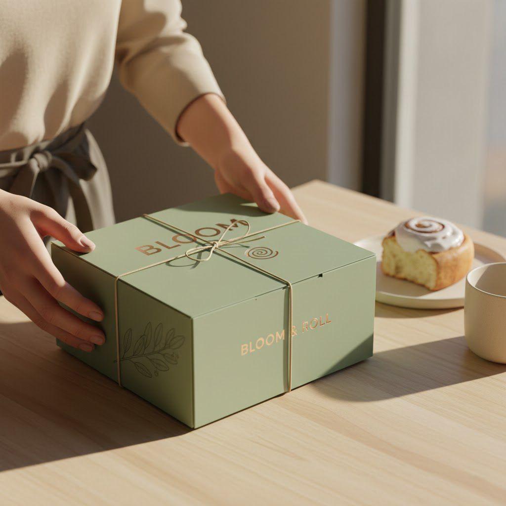
Deliverables included: the logo and visual identity system, colour palette and typography guidelines, packaging for cinnamon rolls and brioches, branded takeaway bags and boxes, printed materials and stationery, and the storefront and café branding.
Deliverables
- Logo & brand mark01
- Colour palette02
- Packaging03
- Storefront & signage04
- Stationery05