Mauboussin Logotype
A minimal logotype born from the diamond and the four-leaf clover.
- Year
- 2022
- Category
- Branding
- Discipline
- Logo design · Charter
- Client
- Mauboussin (unofficial, self-initiated brief)
Overview
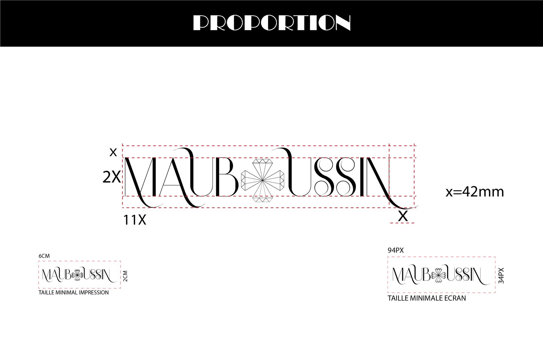
A brand charter presenting the foundations of a logotype for the jeweller Mauboussin, whose creations have always been built around precious stones — diamonds above all.
Challenge
Capture generations of craftsmanship in a single mark, echoing the shapes that inspired many of the house's designs.
Direction
A composition between the petals of the four-leaf clover and the symbol of the diamond, paired with an elegant, minimal typography.
Process
- 01
Research
From generation to generation, Mauboussin's artisans have drawn many designs from the shape of the diamond and, above all, the four-leaf clover.
- 02
Concept
I built the logotype on that heritage: a composition between the petals of the clover and the symbol representing the diamond.
- 03
Charter
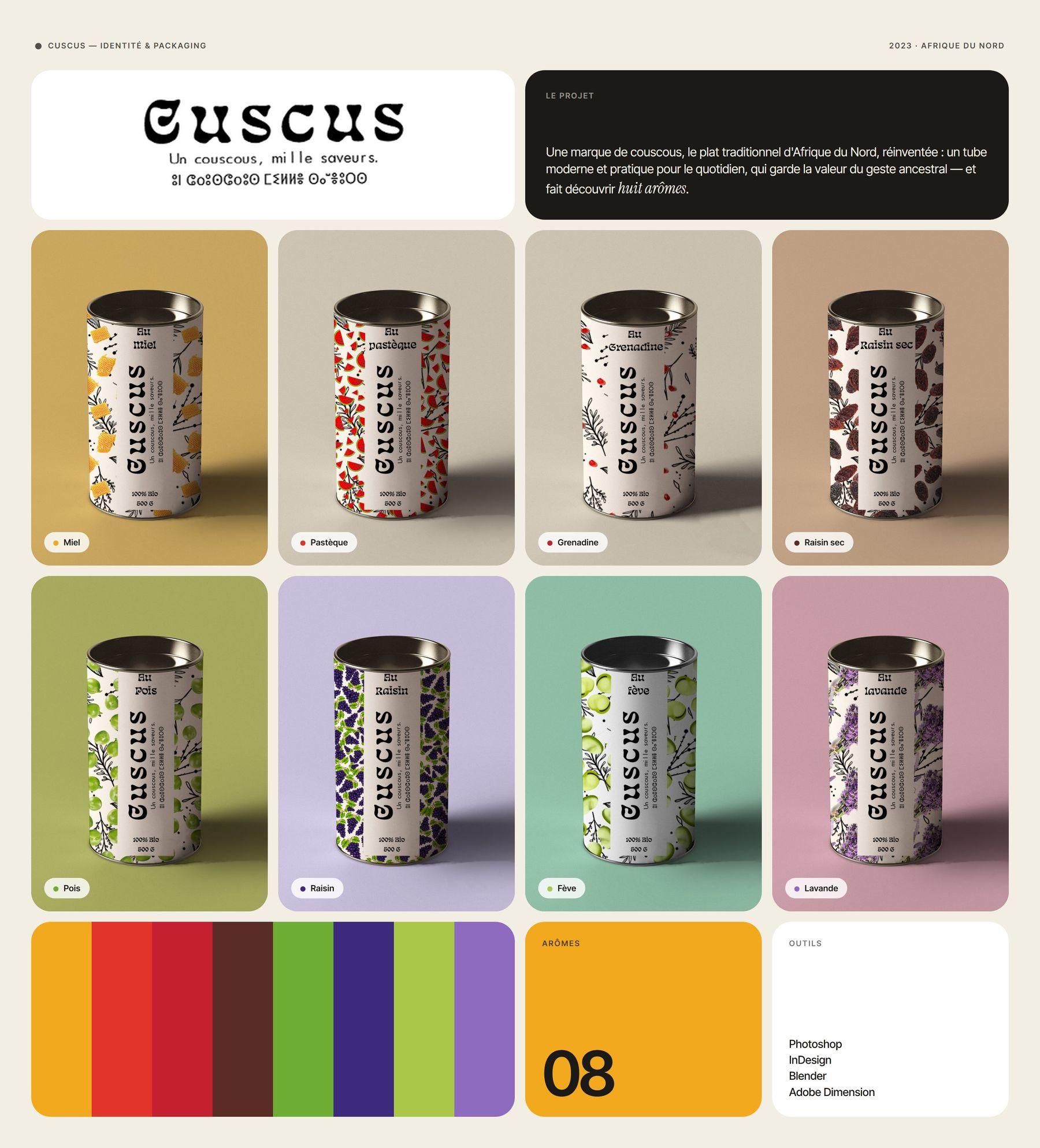
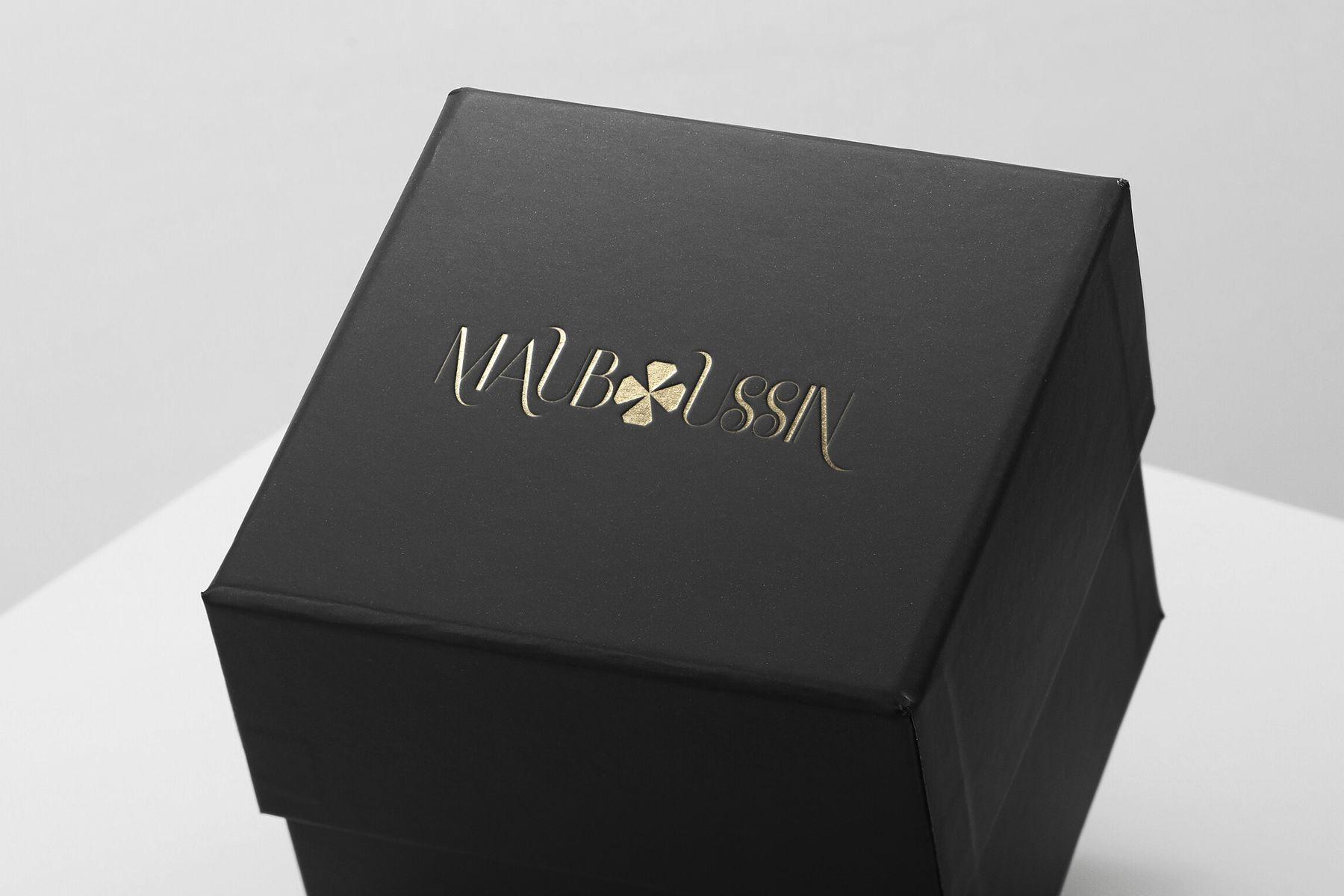
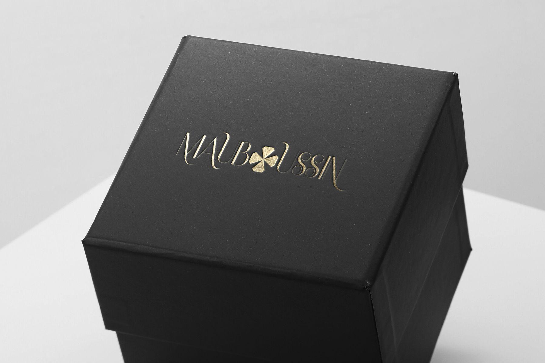
The mark is paired with an elegant, minimalist typography and presented in a brand charter, with packaging mockups.
Deliverables
- Logotype01
- Brand charter02
- Packaging mockups03